Put the useful details within reach
Use clear headings, readable paragraphs and visible contact links. Keep addresses and opening hours in page text, rather than hiding them in an image that needs zooming.
Mobile-friendly websites for small businesses
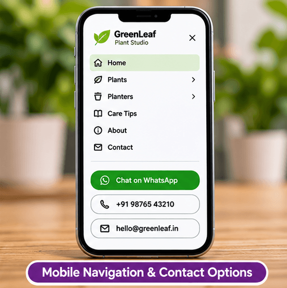
A visitor on a phone may be checking a price, looking for directions or deciding whether to call. Build your page around those tasks and check the mobile layout before sharing your website.
Build and edit free. An active eligible plan is required to publish.
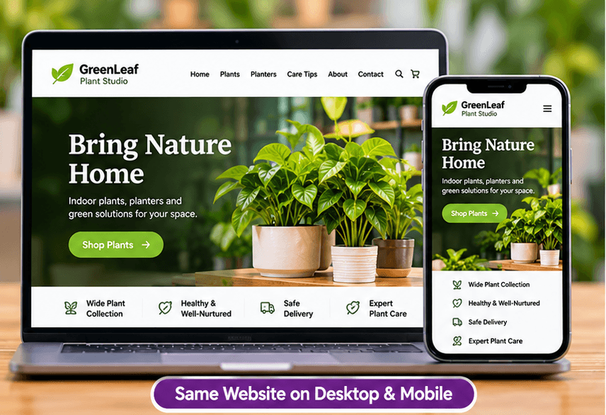
Make the page useful
Use clear headings, readable paragraphs and visible contact links. Keep addresses and opening hours in page text, rather than hiding them in an image that needs zooming.
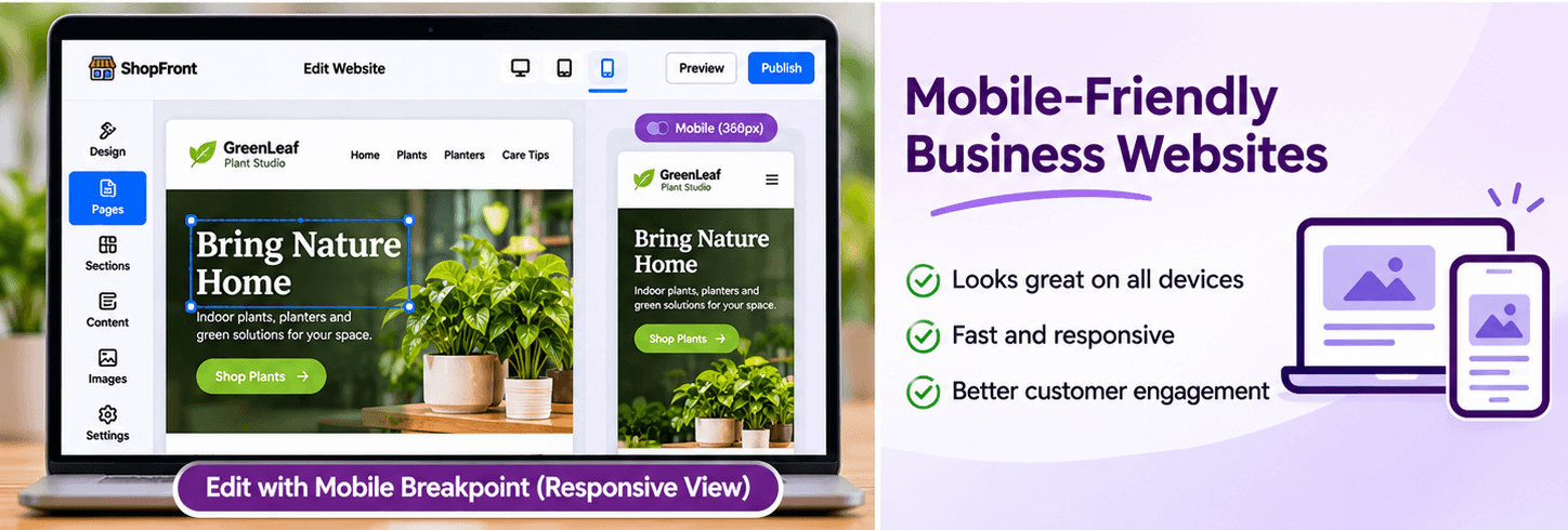
ShopFront's editor has desktop, tablet and mobile previews and responsive style controls. Check how columns stack, whether important photo details are cropped and whether long headings remain readable.
After publishing, open the site on a phone and try the menu, map and contact links. A preview is useful, but testing the actual page catches issues with real content and device behaviour.
Before you build
Choose a template, add your business content and preview the result. Keep later edits in a draft until you are ready to publish them.
Start with the page allowance you need. Review current plans for publishing, custom-domain and email entitlements before choosing your setup.
Compare current plansYes. The editor offers desktop, tablet and mobile controls for supported style settings, allowing you to refine the layout for different screen sizes.
No. Image sizes, page content and network conditions affect performance. Use appropriately sized images and check the finished site rather than relying on a score promise.
Learn how to choose a template, edit your content, preview and publish a business website without coding using ShopFront.
Give website visitors a direct way to contact your business on WhatsApp. Add clear enquiry links and service information with ShopFront.
Plan and build a small business website in India with ShopFront. Bring together services, photos, contact details and your own domain.
Explore the editor, prepare your content and choose a plan when you are ready to publish.
Start building free